
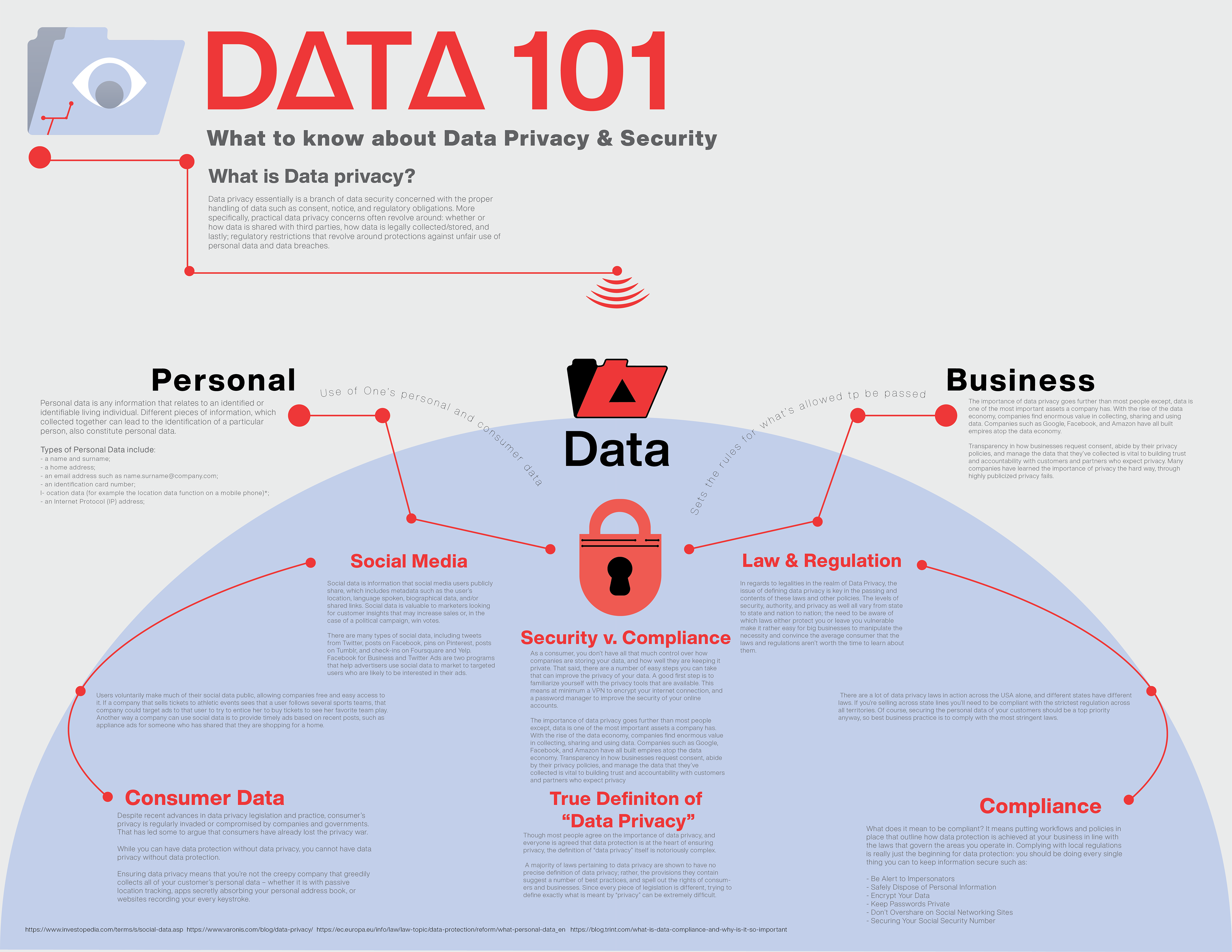
The main goal was to create a cohesive map that describes data privacy and the detail of the topic as a whole. To start the process, I did extensive research on the topic of data privacy and the major aspects that make up the public's view of it then separated into two general sides, business and personal, then further broke down both into the personal and legal sides of data privacy. When it came to structuring the concept map itself, I decided to go with a top to bottom breakdown approach starting with the main topic, briefing what it is and then further going into those two main aspects, graphically breaking down personal and business into the sub topics such as consumer data, social media, etc.
This being the first concept map I’ve ever made I feel as if I learn how to properly research and collect data as well as being able to organize all of the data and make it into a clear concise document to digest. As far as what I revised, I made minor adjustments to certain color choices and graphics such as connecting lines and certain subheadings throughout the map itself.
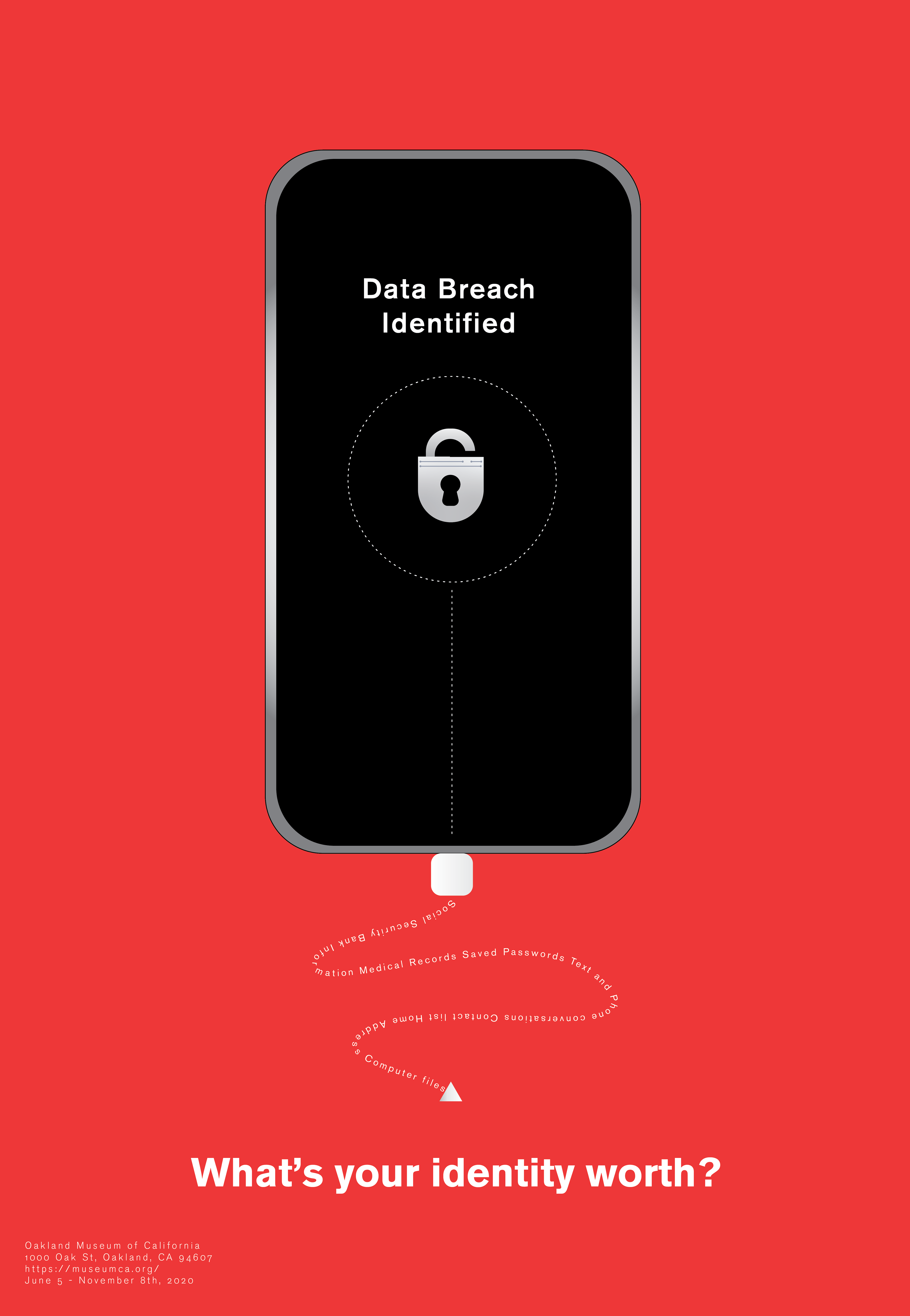
As a continuation from the content map, I wanted to create a compelling and eye-catching poster to go along with the topic of data privacy. Mostly using the motifs of security, I came up with the idea to use a lock and phone as the main symbols of personal data and data privacy as well.
To further emphasize that, I chose to have the smart phone be dead center in the poster while the negative space is taken up by the red color to represent the latent dangers of being in the dark about the details and loopholes that are the laws and regulations involving data security. To emphasize data being stolen, the addition of a chain of data leaving the phone in the form of an adapter cord would be able to illustrate that action clearly enough without it being too obvious.
While coming up with compositions and beginning versions of this poster, I had slowly come to realize how effective is very simple and minimalistic graphics can be; a common thing I saw in most effective marketing for art exhibitions was the use of simple yet bold visuals and messages that are able to stick with a person long after they first seen it, which is when I came up with the current composition you see now.
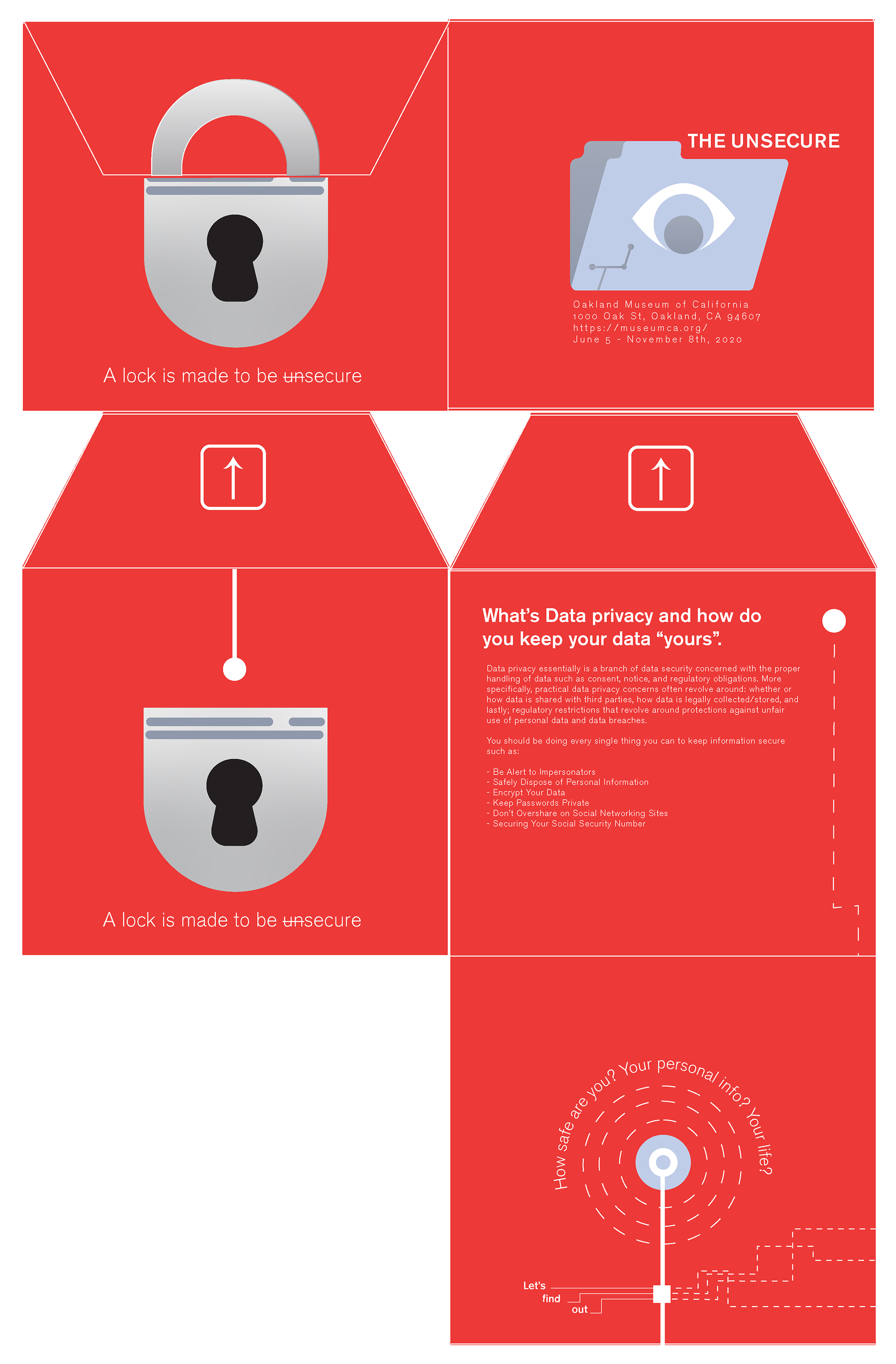
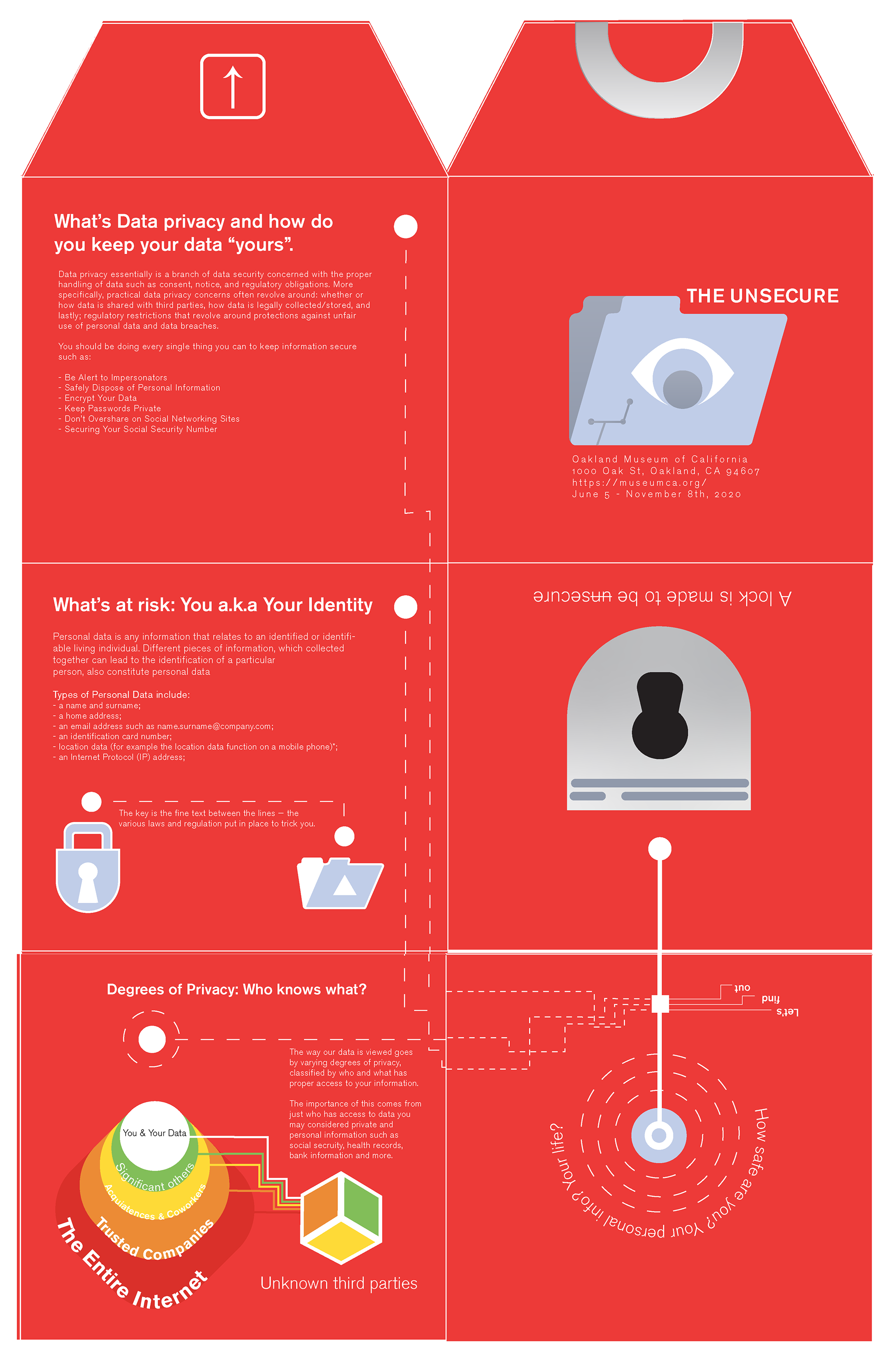
As the next step in creating a design system for my topic of data privacy and the exhibition being held at the Oakland Museum of California; I thought it would be the best to create a good blend of very illustrative graphics like in the poster as well as include the mind opening information present in the content map. To begin I decided to research a number of different folds and templates of brochures to see which fit the topic the most, coming to the conclusion that a six panel brochure that resembles a closed envelope would be the most effective type of brochure; it being a play on the visual of an email.
Moving on, I figured out the order from panel to panel, choosing where and when to include bits and pieces of information or add the graphics to keep the viewers interested in the subject matter present in the brochure itself. Once I finished the pagination, I decided to take certain graphics present in both the concept map and poster, tweak them ever so slightly, and then incorporate them with an adapted style from the concept map.
From this project, some of the major things I learned are presentation and orientation, realizing how necessary it is to be able to understand how something will look fully done and printed in person as well as how a person will experience the physical work such as a brochure used for a exhibit instead of from the view of the designer simply making said brochure.
To cap off on the design system, this project was to create a short animation that emphasizes the main purpose and point of the topic and exhibition as a whole. Much like the other projects, my main approach was to come up with an effective way to get the attention of the viewers and spark curiosity in what the animation is about. Going off of the same method as the poster and brochure, I wanted to use very simple yet bold graphics to be visually engaging enough for viewers to learn about data privacy as they watch.
By illustrating the process of bugs hacking into a lock representing data security and corrupting the heart of security in the form of people's personal information such as password logins, pin numbers, bank info, etc.; it would create an immediate concern in the view were of “am I really as safe as I think I am?“ As far as I've learned, I’ve learned how to use the program after effects as well as the basics of animating as well; not to mention how to develop compelling storyboards to come together as an animation. But truly, I’ve learned how to advertise by using effective techniques in order to engage the viewer and leave them with a sense of curiosity.